Ready or not here it comes, Facebook Timeline for Fan Pages

On March 30, roughly two weeks away, Facebook will move your business page to the new timeline layout whether you like it or not. From the looks of it, the articles read and the activity levels it appears that the timeline is good for business. But, why is that? Well for starters, those companies that have timeline already, namely the big brands with even bigger budgets have created campaigns utilizing the new premium products that family with the new timelines. However, it goes beyond the complementary ad campaigns to a well-planned strategy that includes arresting imagery and engaging content.

Milestones
Big brands like Ben & Jerry’s and Coca-Cola may have had a leg up on the competition knowing that they would be the elite brands to introduce timeline. However, they did their homework and took the time to document every important milestone from the day they were founded to today. Facebook milestones are large featured images like the one below that spans the full timeline wall showcasing the important events in company’s history.

Ben & Jerry's Humble Beginnings - Founded May 5 1978

Pin Posts or Highlight
Beyond promoting historic milestones, companies have the ability to “Pin Posts” or “Highlight” posts to differentiate the content from the rest of the conversations occurring on the wall of a business page.

“Pin Post” means that a page’s admin can choose one post to feature at the top left corner of the timeline for one week. This post will remain where it is (front and center) no matter how many posts you publish during the seven days.  Notice the little gold ribbon at the top of the post below that denotes the “Pin”. Pinned posts hold a great deal of weight so use the space wisely.

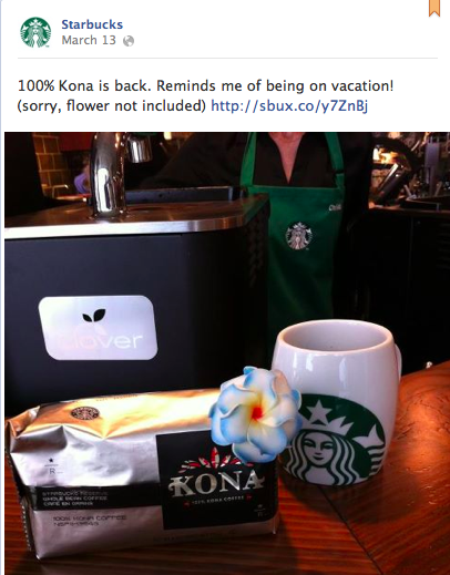
Starbucks' pinned post

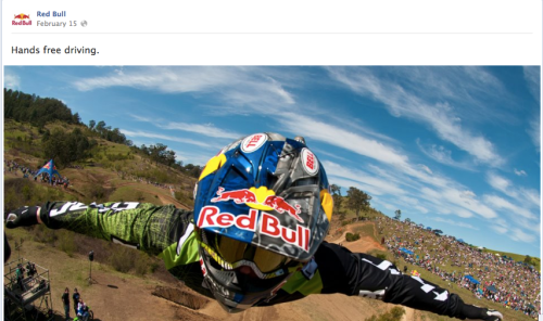
Highlighted posts can be found throughout a business timeline. Similar to a milestone, these highlighted posts receive the same amount of geographic space, but don’t carry the same historical references. Instead they are simply fun call outs for happenings, events and opportunities.

Red Bull Highlighted Post

Cover Image
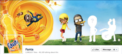
The cover image is the prime piece of real estate located at the very top of your brand page. Your profile image merely a square within the 851 x 315 pixels of pure advertising beauty. This space has incredible potential. It can instantly engage fans, promote your business and share a wealth of information. However, it cannot be used for call to action messages, arrows pointing at the “Like” or “Share” buttons or for contact information. Fret not business friend, even with the red tape a cover image can be the difference between simply a good timeline and a great timeline.

Fanta Cover Photo with seamless profile photo integration

Custom Application Thumbnail Images
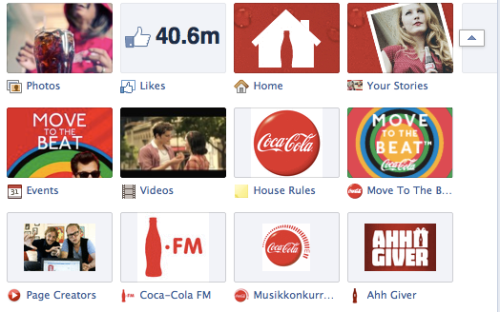
The application icons located below the cover image are now customizable and the ideas are endless. Use the 12 slots to promote campaigns or as seamless brand call to action opportunities. Focus on the potential strategies and feel free to change things up with new call outs to keep the information fresh and your fans interested.

Coca Cola Tab Iconography

Create your Custom Timeline Package Today!
To learn more about the new Facebook Timeline for businesses or to discuss how Rhyme & Reason Design can help create custom graphics or strategies for your business page feel free to call or email us today.

*The above examples were not designed by Rhyme & Reason Design, they were used as examples of companies who were initially aware of the timeline design changes and needs.

A method and a site devoted to understanding how your body moves

Have you ever heard of Moshe Feldenkrais or his Feldenkrais Method for centering your body, addressing pain and expanding fluidity in movement? It’s okay if you haven’t. We only recently were introduced to the method in January and since then have been working to perfect our pronunciation of the word (it rhymes with rice).

We owe our newfound knowledge and interest in understanding the way our bodies move to Joyce Gudger, the Guild Certified Feldenkrais Practioner who enlisted our help to craft a website that evokes a calm, peaceful vibe. Beyond the visual appearance, the site had to be built with a content management system and cost less than a pretty penny. A fairly tall order for a tight budget, but we were up for the challenge.

To begin, we offered Joyce the option of a customized template as opposed to a fully customized site. This solution allows those with budgetary constraints the opportunity to essentially have their cake and eat it too. For customized template projects, we don’t create a website from scratch, instead we do our research about a company and then venture out to find a previously designed template theme that can be modified to achieve required site goals and mirror branding. Joyce was very happy with the idea of a customized template as it provided her the opportunity to not only partner with R&R but, it meant her site would not be a financial strain and would launch in less time.

Once we found the perfect theme for Joyce’s site, we molded the template to fit her needs. For starters, she wanted to create the connection between nature and the human body, so imagery and colors needed to express that natural, organic state.  Font and graphic colors are shades of green and brown and one impactful image of a large tree is carried throughout the design. Because the site was modified from it’s original state, custom programming was also necessary in ensuring the site functioned soundly and specifically for Joyce.

The site recently launched and although its original state was a pre-packaged theme, it has very few remnants that suggest it was a template. To learn more about the Feldenkrais Method, find relaxation or to enjoy the uniqueness of a customized template, visit www.joycegudger.com.

Looking for more insight into our creative process? Check out our Pinterest branding boards today.

Taste of Florida, summertime in a bottle

There’s nothing quite like a day at the beach, from the warm coastal breezes to the appearance of sun-kissed skin, it has a way of relaxing the mind and reviving the senses. However, recreating the experience is not an easy feat, if done incorrectly it could be as uncomfortable as sand in your swim trunks. Luckily for us, our most recent client, Taste of Florida, discovered a way to successfully bottle the sweet taste of summertime.

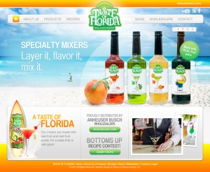
Taste of Florida, owned by Coastal Beverages, offers a variety of premium real fruit drink mixers. Doug McWhorter, the mastermind behind the brand, has spent the better part of the last 12 years focusing his efforts on developing a high-quality product worth pairing with top-of-the-line alcohol. As he puts it, “you wouldn’t pair a filet mignon with powdered mash potatoes, so why would you mix imitation lime juice with your premium tequila to make a margarita?” We’d say he’s got a pretty good point, wouldn’t you?

When Doug came to us more than a year ago, he was looking to impart his fun, Florida style on the masses. His old site, although helpful in providing the necessary product information, lacked the vibrant personality that both he and his brand share. Through initial conversations, it was obvious that two things mattered the most; impressing upon visitors that “Real is better than fake” and creating a space where you can almost feel the sand between your toes. With those two ideas in mind, we channeled the beach in every way, utilizing a bright color palette, imagery straight from where the surf meets the sand and recipes fit for vacation. Beyond the site, we worked with Doug to create marketing and business materials that mirror the Island aesthetic, ensuring that life with Taste of Florida really is a beach.

Now that we have wet your taste buds, check out the real Taste of Florida site to create your own recipe du jour, or stop by your local watering hole for a real taste of the sunshine state.

Pin-mania, what’s your strategy for branding on Pinterest?

As the resident social media manager at R&R, my job requires that I am up to date on all things social, which essentially means I spend a great deal of time reading about Facebook, Twitter and any new or buzz-worthy social darling. The latest platform to flirt with the masses is Pinterest. In case your job description does not include reading copious amounts of social media related material, Pinterest is a virtual pinboard that allows you to “organize and share all the beautiful things you find on the web.”

Turns out, there is much to share. In fact, Pinterest was ranked in the top 10 social networks by Hitwise in December 2011 and comScore reported 11.7 million unique users in January 2012. Yet, it appears pinning is for women, with a whopping 80% of those unique users representing the fairer sex.  Now why is it that women love it and men shun it? Perhaps it has something to do with an overwhelming number of boards devoted to fairy-tale weddings and bouncing babies. However, there are just as many boards promoting fitness and travel, both gender-neutral topics.

As a woman-owned company you could say it was only natural that we’d take up pinning. However, the opportunities to socially engage on a local or global scale and create additional touch points for potential brand advocates are far more compelling then the ratio of xx to xy chromosomes currently pinning.

Using Pinterest for professional as opposed to personal purposes does remove a bit of the romantic and wistful qualities of the site, but it does allow us to create a visual story board for our fans, followers and clients to partake in the act of design. Currently, we are experimenting with the boards for two logo projects. The projects will remain unnamed until they are completed, but with color choices, font selections and inspirational elements we are offering a peek into the typically private world of creative concepting. Our hope is that through these boards, we will gain followers who check back frequently to see the evolution of a design from start to finish as well as individuals who are drawn to our aesthetic and share it with others.

Pinterest may be female-centric now, but as with any social media platform it can change tomorrow. So don’t turn your nose up because there are more dresses than suits scouring the site. Instead, focus on creating a sound strategy that can successfully meet the marketing objectives for your business.

Desperately Seeking Logo Love

Over the past few years, we have helped many clients, from start-up ventures to organizations rich with history, define an identity for their company. We follow a branding process that allows us to delve into the internal culture of a company, gleaning information about the product/service, competition, target market and geo-political factors that influence the brand as a whole. Once we have fully immersed ourselves, gathered responses to design-related questions and uncovered the inspiration both hidden and pronounced we craft a creative brief.

The creative brief is a synopsis of the company story discovered during the research phase. If approved by the client, it becomes the guideline and the written mood board for our design team. If not approved, it is revised until the verbiage accurately portrays the desires of the client and the needs of the company. The creative team digests the information and renders designs that appropriately convey the written word.

Once we have designed a few marks that we believe best capture the essence of the research and the creative brief, we present the designs to the client. After the designs are presented, our orderly design process, no matter the client, begins to devolve. Now, it has very little to do with the size of the client or our designs. Instead, it has everything to do with a near compulsive need to find what we refer to as logo love.

The quest for logo love can be a simple short-lived jaunt or a debilitating marathon. Some clients may instantly find amore with one of the designs we present, while others find the passion after several revisions to a chosen direction. Yet, there are still those who plow through upwards of 10 rounds of revisions and still can’t find that loving feeling.

Those who fall in logo love at first sight are a rare-breed. These clients tend to have a very clear vision from the word “go”, have a creative streak and have a clientele or peer group that shares a similar affinity for a particular design aesthetic.

Clients who require a few revisions tend to be the norm. These decision-makers have an instant idea of what they like and what they don’t like as soon as they lay eyes on their designs. There are usually a few elements of a couple marks that they are drawn to and request to see a combination of logo “A” and logo “B”. This hybrid logo will then go through a few slight tweaks, but sooner rather than later, the client will get the warm fuzzies for their mark.

Those decision makers who can barely find even a warm or a fuzzy feeling for a logo are sadly not as rare as us creative types would like. These clients either have too many great ideas or at a complete loss. They tend to fixate on small aspects to the detriment of the bigger picture and often experience logo lethargy where they become so overwhelmed by logo designs that they shut down, rendering themselves virtually incapable of making a decision or finding love.

Our best suggestion for the love lost Romeos is to take a step back, remove the excess designs and return to a simpler place. It’s also advisable to stop listening to the peanut gallery that has assembled, instead do some introspection of the company and the target market. I hate to burst the bubble, but logo love may never come, but logo ‘like’ will certainly arrive.

Hello Mobile

We threw confetti last week to celebrate the completion of our longest running project. Well this week, I’m asking for each of you to hold up your iPhones or you iPads to toast our new mobile site. An internal feat that may rival our client’s for longest running initiative. However, to our defense, there is in an old expression that sums up our reasoning quite well; “The Cobbler’s Children Have No Shoes”. According to Wikipedia (phew thank goodness there was no black out this week), the phrase is, “used to describe the phenomenon where certain ‘professionals’ in any given area are so busy with work for their clients and their teams that they neglect using their professional skills to help themselves or those closest to them.” I’d say wiki has it spot on.

To be honest, we’ve known for years that our beautiful (yes, I am biased) flash-based website was not compatible with any of our iPhones, but one awesome client lead to another and before we knew it all of our clients had mobile sites and we had the blue question mark. We were reminded regularly of this fact and it was one of the many thoughts that kept us at night, the other ones just happened to be more pressing. Well at last, we have provided our “children” with shoes. Okay so we don’t have children and we don’t make shoes, but we have given our iPhone and iPad enthusiasts something to see.

You won’t find any angry birds or words with friends, but you can view a sampling of our work on the portfolio page, read our blog, send an email or call us with one touch of a button. Okay enough talking about it, scan the QR code* below (or go to RhymeAndReasonDesign.com on your phone) to check it out and if you really like this blog you can read it again on the mobile site!

*Don’t know how to use a QR code? It’s cool, we didn’t know what to do with one the first time we saw the little digital box either. What you need to do is download a QR reader from the app store on your phone. Once the reader is installed click on the icon to run the program and then point your phone at the QR code and lead the reader scan it.


A Look at Silver Ring’s Lookbook

Silver Ring Splint Company, I’m sure you’ve heard us talk about them before. They’ve been with us since the beginning and have racked up a number of R&R paper plate awards along the way. Not only are they our longest running client (they were one of our first!) but they also hold title for the longest running PROJECT, rolling in (by our calculations) at 2 years, 11 months and 14 days. What did it take to get there? Endless creative ideas, numerous photoshoots and, most importantly, stamina.

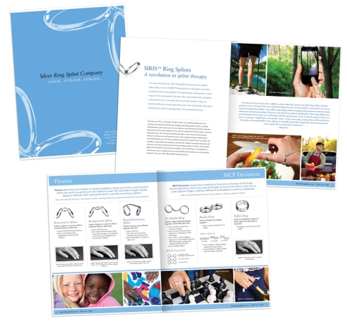
While their title reigns on, the project thankfully will not. Amidst champagne corks and virtual congratulations, the Silver Ring Splint product lookbook received final approval and went to press late last month. We couldn’t be more proud. Its 12 pages cover the most popular Silver Ring products, applications and sizing information and will circulate to therapists around the globe. The quality of the catalog is but a small reflection of their dedication to the perfection of their products. Sleek and stylish, every ring they make is both beautiful and functional. The full brochure will be online soon, but in the meantime, here’s a glimpse.


We are awaiting our hard copy to make sure this dream is a reality, but we’re already moving on to the next big thing for Silver Ring Splint. This year will hold great things for them as they continue to push both the digital and tangible frontiers, exploring new products and engaging in the social media realm.

Accelerating the New Year

Like many a good resolutionist, we’ve been working tirelessly this January to keep up with all of our new years commitments. We’ve challenged our minds and bodies, both personally and professionally, in an effort to make 2012 our best year yet.

What’s on that list you might ask? Well, I’ve been diligently working on the new R&R brand and balancing the de-cluttering of a new house, Scarlett’s enthusiastically pursuing new business and is tackling her first ever half marathon and we’re both making a concerted effort to step up our entrepreneurial prowess.

To hold up my end of the deal, in December I joined a group called Entrepreneurs’ Organization Accelerator. They may not have a creative name (!) but it is one sharp group of people with great ideas and solid business acumen. The organization offers monthly accountability meetings with a tight nit group of fellow entrepreneurs and quarterly daylong seminars.

My first seminar was just last week and I enjoyed a solid 8+ hours with my entrepreneurial peers discussing one of the biggest variables of small business…PEOPLE. We discussed communication tools to create better correspondence, learned about ROWE (Rewards-only work experience) and heard from a number of once small (now large) business owners about the growth of their companies and how they manage their, you guessed it, people.

While we may not have 100s of employees under our wings, we do work with a broad scope of clients, vendors, partners and friends, which make up our robust, remote work environment. We appreciate you all and hope that through events like our Accelerator People day that our professional relationships become even stronger. Here’s to a happy and healthy start to 2012!

Death and Taxes

What’s that saying about death and taxes? Oh yeah, they’re both inevitable. Well, it appears that the taxes part is upon us, and not just the kind that we need to file.  This past Friday, we launched a website for Garris and Company, a Certified Public Accounting firm in Charlottesville, VA.

Garris and Company has been successfully assisting companies and individuals with their accounting needs for the past 28 years. In so doing, they’ve had the opportunity to grow their network outside of the Charlottesville area and are looking to expand their reach even further in the coming years. As we all know, finding a good accountant is not an easy task and it often involves word-of-mouth recommendations and/or an in-depth Google search.  Garris and Company, understanding the importance of both, came to us for assistance in creating a website that would bode well in a Google search and pass the word-of-mouth challenge with flying colors. We of course, were happy to offer our services in the design and development portion, but are leaving the word-of-mouth part up to their extremely satisfied clients.

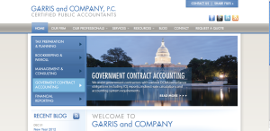
The website, garriscompany.com, is instantly inviting with a modern and active home page. The initial slideshow offers visitors the chance to easily learn more about the services offered, while a Recent Blog RSS feed appears on the left hand side of the page and will populate anytime a new blog is added. Easy, one-click buttons assist visitors in requesting quotes, sharing files and uncovering Garris and Company on a variety of social media sites.

Beyond the home page, the site is chock full of useful information that helps visitors not only understand their accounting needs, but personally connect with a CPA or bookkeeper of their choice. Visitors can choose to email an employee directly for assistance or use any one of the resource links provided to make financial matters less stressful. As you browse the site, beyond the clean, welcoming aesthetic, you’ll notice that there is a plethora of facts and information, written in terms that non-accountants can understand. It is this knowledge sharing and core belief of educating their clients that has made Garris and Company one of the first firms to be discussed among peers and what will also increase its presence on the web.

Taxes are inevitable, so take our word and visit garriscompany.com.

R&R predicts 2012

We are a little infatuated with the number 12. Perhaps it has something to do with the time of year, there are 12 days of Christmas, we count down to 12am on 31st day of the 12 month and we just rang in the 12th year of the 21st century. So in honor of the hot little number, we’ve decided to share with you our 12 predictions for 2012. Don’t worry they have nothing to do with the Mayan, Mesoamerican Long Count calendar.

  1. Rhyme & Reason Design’s website will launch anew – iPhones and iPads rejoice.
  2. Facebook, King of the Social Media mountain, goes public – a plethora of status updates ensue.
  3. Google’s search optimization algorithm forces users to visit the ghost town that is Google+
  4. The 2012 United States Presidential Election becomes a breeding ground for viral videos, SNL parodies, rogue tweets and many more pop cultural gaffes
  5. Pinterest increases the craftiness of females around the globe
  6. Rhyme & Reason Design wins several new clients, enabling us to hire new employees thus kick-starting the cycle of growth
  7. Big Nerd Ranch is first to trend #(an)droiding, BigDroidRanch becomes a cult following
  8. Moffitt Cancer Center will unveil a robust digital presence bringing them closer to their patients and closer to a cure
  9. Alpha Sigma Alpha will celebrate their 47th biennial national convention with a return to their founding state of Virginia – ladybugs will be everywhere
  10. Cookbook Create socializes the cookbook, Garris and Company mitigates the fear of tax season and Taste of Florida mixes up a good time, in other words Rhyme & Reason Design’s clients hit it big in 2012
  11. Steve Jobs left a legacy; perhaps it’s the iPhone 5
  12. Rhyme & Reason Design will celebrate it’s fourth birthday with new clients, current clients, friends, family and maybe even some bubbly.


Rhyme & Reason Design

At Rhyme & Reason Design, website design and development is our specialty and building brands is our passion. We make sure that every project combines creative ideas (the rhyme) and smart design (the reason). We believe you can’t have one without the other.

Authors